You are currently browsing the monthly archive for December 2009.
Happy Holidays!
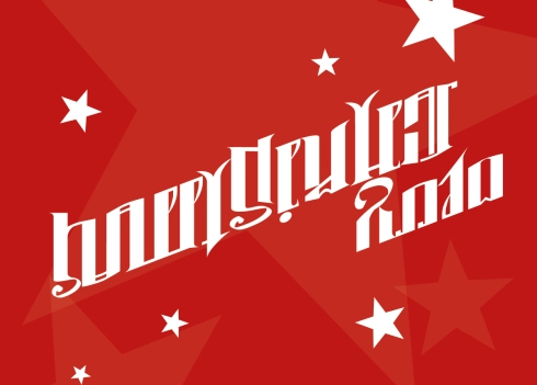
Here is my last submission for the ongoing A.C.A.C (ambigram.com ambigram contest):
In one direction it reads “Merry Christmas” and turned 180°…
… it reads “Happy New Year 2010“.
I’m very happy with the way this design came out in the end. I especially like the clear and kinda “1950’s” look ist has. Everything is in line and the letter forms are consistent. The “C/ar” and “R/W” inversion were a little bit tricky but in the end everything worked well.
I started working on this ambigram pretty early after the new A.C.A.C. started, but for a long time i didn’t kow how to integrate the “Merry” in the design and just writing “Christmas” didn’t seem to make much sense. But on a train ride home from work it struck me: Let’s turn the “Merry” into the number 2010! From that point on everything came together well…
So, all there is left for me to say is: Merry Christmas and a Happy New Year to all of you!
I’m currently reworking the ambigrams I did of the slogans from the novel “1984” (“Ingnorance Is strength”, “Freedom Is Slavery”, “War Is Peace”) in a way that they will share the same style (hopefully not black letter ;-)) and look better. So I thought it would be a nice idea to create an ambigram of the novel’s title itself:
I hope that in the end I will be able to squeeze everything into one design… we will see!
It’s been a long time since I created my last bilateral (“mirror”) ambigram. Here’s one for the pre-christmas season:
Creating a mirror ambigram is often more challenging than creating a rotational one. When you design a “regular” ambigram, you have a lot of space to play with in the lower parts of the design, because the middle and upper parts are more important for letter recognition. But when you create a bilateral ambigram, everything stays on the same level. And not to forget, some shapes look really odd when you try to reflect them…
But, all problems aside, shortly after I started working on this ambigram it became clear to me that I would try to make it a bilateral one because of the middle “V”, which is a real killer if you try to rotate it. …
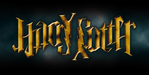
Here’s the next holiday-themed ambigram!
It’s another one done in black letter… Don’t get me wrong, I like the look of black letter and sometimes it’s the best or only way to create a legible ambigram, but I mostly use it if I have no time and want the ambigram to be done fast.
The use of black letter offers a lot of pros:
- Once you have created a set of letters it’s quite easy to adjust them to your needs
- The spacing of the letters ist quite easy
- You can put oodles of swishes and swirls in your design without any problems.
- Nice, tattoo-style look
But I think the designs lose their individuality. I enjoy finding a style that really fits and underlines the meaning of an ambigram, but unfortunately I’m short on time at the moment. But (lucky me!) black letter fits perfectly for holiday themed ambigrams! 😉
So, I will stop whining now, here’s one of the scribbles (there were more, but I don’t hav’em at hand right now):
Most of the combinations were quite easy and natural, but the “a/c” inversion needed a little tweaking. Oh yeah, and in my first drafts I used a lower case “n” and “t” but changed it to achieve a more consistent look.
I’m slowly getting into the holiday mood, so here’s my first christmas-themed ambigram for this year. I’m working on my contributions for the next A.C.A.C. , so there is more to come…
When I started this blog it was clear to me that I would need a nice symbiotogram of the words “unterart” and “ambigram” for the header. I didn’t realize at this moment that this would be quite a difficult task, especially because I had some demands the design would have to meet:
- No black letter
- consistent letter forms (especially the “r”s, “a”s and “m”s)
- easy to read
After a LOT of scribbling, head scratching and swearing I finally found this solution. Thank God!
It can (and will) be more optimized but for the moment I’m just very glad that I was able to solve the problem…
As you can see, there are still some issues with this design. The lower case “r” in ambigram is not consistent, the “e/g” inversion still needs some work and the “ra” combination looks a little awkward.
It’s scribble time (just a small selection):
Ok, here’s a new one. I’m a singer in a ska band called “The Nicks” and I wanted to do an ambigram of the name ever since I started making ambigrams. In that time I had a lot of problems with the “e/c” inversion and when I finally found a solution to this problem (while working on another design), I forgot about my “The Nicks” ambigram. But yesterday I remembered and the solution almost came by itself. So, here it is:
And here’s the scribble I did: As you can see I tend to create my designs from right to left. I don’t know why, but it works better for me to start with the end. The first three letters came quite naturally but I had a little fight with the “ni” due to some proportions problem.
BTW: If your interested in our music, you can listen to it here:
http://www.the-nicks.de
http://www.myspace.com/wearethenicks


