You are currently browsing the tag archive for the ‘quick draw’ tag.
And once again, here’s my version of the current ‘Quick Draw’ challenge’s word:
I tried to achieve a clean, art deco (well, not really) style to match the look of movie of the same name.
I’m not really happy that I was forced to use a small ‘r’, but it would have been much more difficult to design a legible ambigram without the centered ‘O’.
Today the results of the latest “Quick Draw” challenge were released on ambiram.com. Ryan McCourt an Ed Xander, both seasoned ambigrammists, had a real tough problem to tackle: the phrase “I am Spartacus”. Here’s my take on the problem:
The main problem with this ambigram was the ‘I/S’ inversion. I still think the last ‘S’ is really hard to read. The other problem is that it is difficult to separate the single words. And before I forget it: The ‘c’ is very hard to read. So, as I said, a tough challenge…
There was a new “Quick Draw” challenge on ambigram.com. This time the participants were Jen Winklepleck and Prajyot Damle, the given word was “Superheroes”. I decided to give it a shot myself and here’s what I came up with:
This was a real “quick draw” and maybe it’s not very easy to read, but I’m very happy with the flow of the design.
New year, new ambigrams! Well, this particular ambigram was created in 2010, but who cares;-)
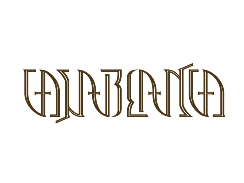
This piece was created for the ‘Quick Draw‘ competition on ambigram.com: Two ambigram artist have to create an ambigram of a given word within a week. The word we had to work with was ‘Casablanca’.
Here are the first scribbles I did:
My solution was pretty clear from the start: The ‘CA’ at the beginning of the word would have to symmetrical to turn into the ‘CA’ at the end. Which did not leave much room to play with the other letters. The main problem was ‘B/LA’ combination. The ‘L’ hat to keep it’s own characteristics but form the curvy part of the ‘B’.
Next I did a clearer sketch of the letters, scanned it and started drawing the lines in Illustrator:
I started experimenting with a graphical element and was pretty content with the result. Until I showed it to a colleague and asked him if he could read the word. The answer was ‘Something with a ‘d’ at the end?’. I had to rework the letters!
I added some angles to the ‘C’s and straightened the design a little bit. Now it was much easier to read. I added some inner lines and was very pleased with the outcome.
Photoshop-Time! I wanted the final image to have a nice black and white/film noir feeling and to look like a name plate. Add some smoke and voila:
And that’s it! Take look here, to see how Anoop Pai B handled the problem.


